The headline numbers appear strong. The official unemployment rate fell to 5.2 percent. Another 225,000 new jobs were created, the 16th month of net increase in non-farm payrolls since the shutdown of the economy. But, the news is not as good as the headline figures suggest. There are some demographic imbalances that warrant attention.
First, the good news.
Unemployment Rate by Gender
Recent recessions have been “mancessions.” While male and female unemployment rates have been quite similar since 1980, male unemployment rises more than female during recessions. A mancession was clearly evident during the recession associated with the financial crisis of 2008. But, during the recession associated with the shutdown of the economy, female unemployment rose more. It can be supposed that this was because men, more so than women, were “essential employees.” Since then, as you can see in the following chart, male and female unemployment have returned to rough parity.

Unemployment Rate by Race and Hispanic Heritage
During the long period of economic expansion following the prior recession, unemployment rates fell for all racial and ethnic groups that are tracked by the unemployment statistics. All of these unemployment rates quickly got much worse upon the shutdown. Hispanics suffered the worst. For a time, Hispanics had the highest unemployment rate among the racial and ethnic groups tracked by these statistics. While all of these rates are still worse than their pre-shutdown levels, the former rank-order of these groups has returned.

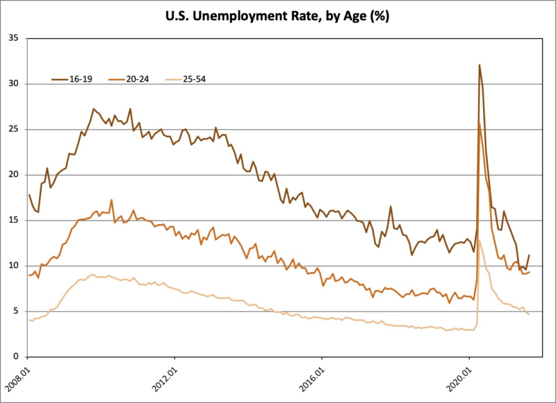
Unemployment Rate by Age
We now come to the first surprising finding. With the shutdown, unemployment rates got worse for all age groups. With the reopening of the economy, unemployment has fallen for each group. Nevertheless, the unemployment rate has not returned to the pre-shutdown level for groups 20 to 24 years, and older. However – and this is the first surprising finding – the unemployment rate has fallen below the pre-shutdown level for the 16 to 19 year-old group (the dark orange line in the following chart).

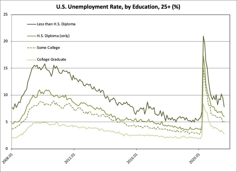
Unemployment Rate by Education
The next chart is restricted to persons 25 years old and older. This chart exhibits the second surprising finding. For persons in the groups with at least a high school education, the unemployment rate has been improving (meaning, the unemployment rate has been falling), although the rates are still not as good as before the shutdown.
But, look at the course of unemployment among persons 25 and older without a high school diploma. That unemployment rate hasn’t been falling during the prior several months. It can be supposed that the strong demand for labor isn’t reducing unemployment among the persons in this group (25 and older without a high school diploma) because of extended and enhanced unemployment benefits. Extended and enhanced unemployment benefits are retarding this recovery, as they did the recovery from the prior recession. Now, as then, the decision to extend and enhance unemployment benefits was effectively a decision not only to slow recovery, but to foster millions of Americans to lives of dependency.

Labor Force Participation
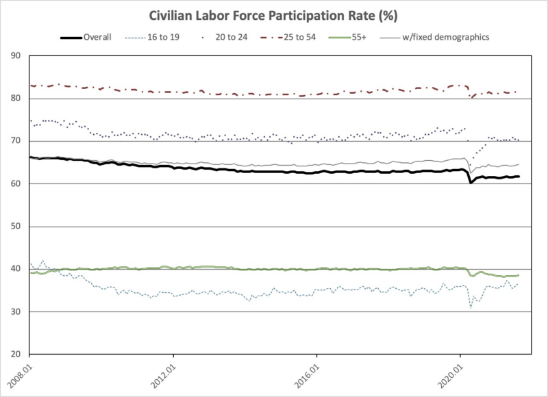
The next chart tracks labor force participation both overall and within certain age-defined groups. Overall, in the thick black line, you see that labor force participation fell and has since only partially recovered. Furthermore, the course of labor force participation has been very different for certain age groups.

At the very bottom, in the light, dashed line, you see that labor force participation has increased among teenagers, abstracting from a temporary fall. This indicates that teenagers are taking advantage of the strong demand for labor in entry-level jobs. Good for them.
Next up, in the light, solid line, you see that labor force participation has fallen among older workers, and has not at all recovered. For almost everybody, retirement is a one-way street. The decision to turn a 15-day suspension of the economy, with jobs preserved by paycheck protection, first into a 45-day suspension, and then into a suspension of indeterminate duration, was effectively a decision to force millions of older Americans into retirement.
The top two lines, pertaining to 20 to 24 year-olds and to 25 to 54 year-olds, both show the same pattern exhibited in the overall figure. Namely, a fall and then a partial recovery.
Returning to the middle of the chart, the thin, gray line tracks labor force participation for a hypothetical economy with a fixed age distribution. This line “undoes” the impact of an aging population on labor force participation. I developed this technique in the following article.
During the slow recovery from the recession associated with the financial crisis of 2008, the labor force participation fell. As I show, about half of the decline was due to the aging of the population, and about half due to factors other than the aging of the population.
During the first three years of the Trump administration, the labor force participation rate, as measured (the thick black line), was stable. With an aging population, this meant that labor force participation was rising within age brackets.
Looking, now, at the most recent two years, labor force participation has flattened out following a weak snapback last year. This is true both for the official labor force participation rate and for my age-adjusted number.
Considering what I call “unmeasured unemployment” related to low labor force participation, similar to “hidden unemployment,” we are still outside the range of 4 to 6 percent unemployment; i.e., we’re outside the range of the “full employment” unemployment rate. The economy is, as many people sense, not as good as the official statistics say.
* This article was originally published here
HELP STOP THE SPREAD OF FAKE NEWS!
SHARE our articles and like our Facebook page and follow us on Twitter!


0 Comments